The Indexed Comparative Bar Chart – More Indexing Goodness in Qlikview
Regular followers of QVDesign will know that I’ve got a soft spot for a bit of good old fashioned indexing (it must be the economist in me) and have created a post or two to try and get it used more by Qlikview developers as, well; it’s simple and awesome. To further that end I’ve created another chart that takes advantage of indexing to show us information that other charts simply couldn’t muster – it’s the Indexed Comparative Bar Chart.
For an introduction to the wonderful world of indexing (Now there’s a topic to introduce into diner party conversation; ‘Never mind you’re career as a brain surgeon, let me tell you about the wonderful world of indexing…why are you yawning?’) take a look at my previous index related post: https://qvdesign.wordpress.com/2012/05/09/the-indexed-time-series-chart-the-forgotten-technique-at-least-by-most-qlikview-developers/
In my last post and 99% of other cases in the wild indexing is displayed via a time-series line chart; we see how things are at a point in time compared to what they were in another, for instance changes in sales across several years: all very useful. What if we wanted to see how sales people’s performance was relative to the top performer across several product groups or how a products performance is relative to others across different markets? – we shouldn’t use a line chart as ‘Sales Person’ is a non-continuous dimension so its the Comparative Indexed Bar Chart that can show us the way.
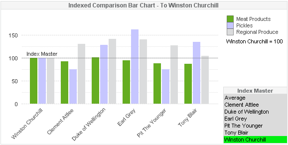
As is the case with many of my chart examples we’re looking at British Prime Ministers and their careers selling regional British Produce in a very basic sales dataset. I’d like to know how each Prime Minister has performed (Sales wise not politically) across the 3 Product Groups we have relative to a Prime Minister of my choosing –or vice versa; how one has compared to the rest (perhaps for use in a Prime Ministerial 1-to-1!?). So to do this I can use the indexed chart below:
You can see in the above example that I’ve selected Winston Churchill, this has caused him to move to the left of the chart and to be labeled ‘Index Master’ but most importantly his sales values for each Product Group have been set to 100 via the Index Factor (see previous index related post). As with a time-series indexed chart we then simply apply this Index Factor to the sales values for the other Prime Ministers to see how they all performed relative to Winston. We can for instance see that Mr Churchill sold more Meat Products than everyone else bar The Duke of Wellington however everybody else sold more Regional Produce than he did – why is he so much better at selling Meat??. Of course this could be shown with a traditional grouped bar chart; we’d see who sold more and who sold less, but think what the chart would look like if Meat Products were sold in the order of hundreds of thousands of units whilst Pickles were only in the order or a few hundred – the Pickles bars would be tiny and the variances impossible to distinguish. That’s why we use indexing – it levels everything out, we are in effect looking at percentage difference and not actuals.
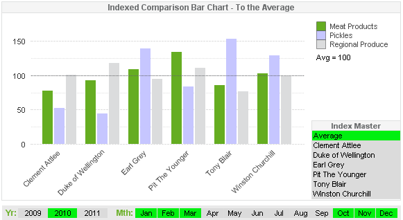
I’ve also added an ‘Average’ selection to the list of Prime Ministers and by selecting this our indexed value becomes that of the overall average which allows us to know how each Prime Minister compares to the average.
The expression used to drive the chart is a relatively straight-forward one:
=sum(Volume)/(sum(total<Product_Group>$<Name={‘$(v_Sales_Name)’}>}Volume)/100)
The variable ‘v_Sales_Name’ is simply =SalesName (our list of Prime Ministers which is set to ‘Always One Value Selected’) so what the expression is doing is: taking the sum of each Prime Ministers sales volume and dividing it by the sales volume of the selected Prime Minsiter divided by 100 – easy.
The rest is even easier than that so download the sample .qvw and have a look around, the file can be accessed here: https://docs.google.com/open?id=0BxloTMUod74tejdUbnExdDJSYjQ
*I’ve had a few people contacting me to say that the Google Drive docs aren’t accessible, I think this is down to older versions of IE not being compatible (as well as being generally rubbish) so I recommend trying Firefox if you have any problems.
So there we have it; The Indexed Comparative Bar Chart, it’s not going to change the world but I think it’s a good one to have in the proverbial Qlikview toolbox ready to quickly and easily deploy when the requirement suits. All indexed charts are not that much harder to create than their standard brethren but where standard charts tend to only show what happened adding an index can show that extra level of crucial information that would otherwise remain hidden.
As always I hope you can put it or something similar to good use.
All the best,
Matt


Hi,
Thank for this good post, as usual !
I will use this good comparative chart, it’s exactly what i needed in the app i’m working on.
Hey Matt,
Thanks for another great post. Following your blog on a regular basis. It is very useful and interesting
Awesome. I really like it. Should come in handy for me.