Lessons for Dashboard Developers from the GB Olympic Team – Really?
The worlds of Sport and Dashboarding; there aren’t many parallels there surely? Yes, you could create a dashboard to report on sporting data and that would be very nice indeed but what about actual parallels and lessons we as dashboard developers could learn from sport? Well, as a resident of Great Britain I’ve been saturated with wall to wall Olympic coverage (along with the odd patriotic tear) and in amongst all the success, failure and heartache one thing kept coming to the fore; how exactly had Team GB managed to get to where it is in 2012 from where it had been; 1 Gold Medal in 1996 at the Atlanta Games vs 29 and 3rd in the Medal Table in 2012 – quite an improvement. It turns out one of the main reasons has a place in dashboard development…at least I think it does so let’s tell the story.
Of course probably the largest factor that contributed to Team GB’s success is the simple fact that a lot of cash (£250m+) and resource was thrown at the athletes involved allowing for better training facilities, coaches and physios as well as meaning the athletes could focus on training fulltime instead of having to hold down a paying job. However one of the more overlooked methods that lead to great improvements and which was employed with particular zeal in the cycling events contains a very simple methodology for all dashboard developers.
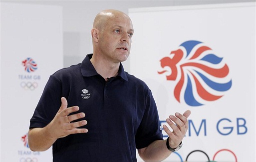
Team GB utterly dominated the Olympic cycling events especially in the velodrome, that’s not patriotic fervor on my part; the facts back it up; 10 events: 7 Gold, 1 Silver and 1 Bronze…and that’s with several controversial relegations and the sports governing body limiting the number of entrants to lessen the chance of such domination. Obviously the athletes played a huge part in those results but one man and his management played perhaps an even bigger role; Dave Brailsford CBE; the Team GB Cycling Performance Director (and boss of Tour de France winning Team Sky).
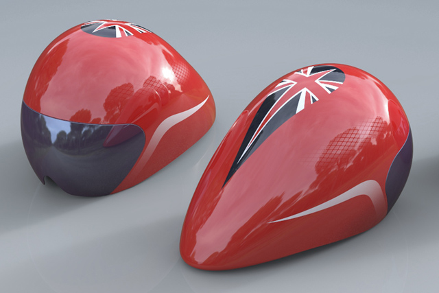
Brailsford completely transformed the performance of the Team GB cycling squad through his particular brand of micro-management to such an extent that a member of the French Olympic team suggested that perhaps some kind of secret illegal wheels were being used on their bikes to achieve the team’s performance…the wheels were in-fact made by French company Mavic so that wasn’t it!. So what did Brailsford do? The world of professional cycling is a very narrow place; all the competitors have trained and practiced for most of their lives and the equipment is relatively homogenous (bikes are hardly F1 cars) so how can you raise a batch of cyclists over and above everyone else; where there’s no obvious room for improvement; you’re not going to shave 10sec of a time by suddenly inventing a new type of bike or new training method. This is where the genius of Brailsford’s method (and the supporting cash) comes in. Team GB took the sport of cycling and blew it apart, every component was looked at by specialists; the bike, the training, the nutrition etc etc before those elements were further broken down again; the wheels, the tyres, the helmet… They ended up with hundreds of individual components that could all be improved upon even if only slightly. Even though people thought there wasn’t much room for improvement in cycling, by making small improvements to many of the separate constituent parts of the sport and then combining them all together Team GB was able to deliver the performances we saw in London.
The extremes that this ‘micro-innovation’ concept has been taken to are bordering on ludicrous; all the equipment is tailor made for each athlete: not just the hand made carbon fibre bikes but the helmets and shoes as well, nutritionists plan every meal, training schedules are mapped out to the minute, it even goes as far as the athletes always having the same pillow when they’re away at events to aid relaxation back at their hotel. Basically everything was looked at by experts in the appropriate field and everything that could be improved was, no matter how small it seemed. This was all backed up by data that was analysed to look for further areas for improvement, this was engrained in the team; when Bradley Wiggins crossed the line of the final time trial of this years Tour de France and knew he’d won the overall race before raising his arms in celebration he first stopped the computer on his handle bars to ensure the data was accurate – nothing gets in the way of possible improvement. Each improvement on its own may be very simple and only deliver a .00001sec of an advantage but add them all up and you end up with 7 gold medals.
So how does this relate to Qlikview and dashboard development? Simple really; just like there are individual components that go into making the sport of cycling there are many individual components that go into making a dashboard (or a car or a house or a machine or pretty much anything else for that matter) and by following the same principals almost any dashboard can be improved upon.
Let’s look at just a few of the components that go into making a dashboard what it is and how they can be analysed and improved:
1. Color – are you using the most appropriate colors? There are many books that set out the rules for effective color usage it’s simply a case of applying them. This isn’t just for your headline colors it also applies to things like the hue of black you use for axes labels or the brightness of your object borders.
2. Alignment – are all your objects lined up correctly, if they’re out by even a pixel it all goes towards detracting from the overall impression of your dashboard.
3. Annotations – can small amounts of narrative information be added to any of your objects to make them easier & quicker to interpret?
4. Have you made the right object choices – this is so simple; read information from your dashboard and put yourself in the position of being a consumer of it’s information; is that chart you’ve created actually showing anything of use? If not get rid of it.
5. Fields – have you left any unused fields in the dashboard, leave too many and you risk the performance of your dashboard / server being affected – I know the chances of this becoming a major issue are low but having unused fields is going to increase the size of your .qvw meaning it requires more RAM on the server and takes longer to open, ergo; room for improvement. Download a copy of Rob Wunderlich’s Document Analyzer to help you here: http://robwunderlich.com/home/2012/6/19/new-document-analyzer-v113.html
6. Post deployment analysis – just like Team GB gathering data on their athletes we can gather data on the usage of our dashboards through the log files or simply by asking people, it’s easy to find out who’s doing what with your dashboard so amend after the fact to tune and improve it.
Those are just a few of the areas and all of the points are based on rules, it doesn’t matter who you are, whether you’re a ‘creative’ or the geekiest of developers who ‘doesn’t do layout’ you can follow simple rules to easily get the basics right and produce a great dashboard.
So here are my 3 main parallels between Team GB’s cycling team and Dashboarding:
- There are individual components in cycling as there are in dashboard development all of which can be looked at and improved separately to greatly improve the combined whole.
- Team GB used experts in each field to analyse the components of cycling, dashboard developers have books about the science of visualization and dashboarding that contain simple rules that can be applied.
- Where Team GB needed and injection of cash to support all the ‘micro-innovation’, support staff and training the hard currency for dashboard development is time – it’s a limited resource but the more you devote the greater the improvement.
Time for a touch of realism.
Of course spending 12hrs choosing between rgb(20,20,20) and rgb(30,30,30) for your axis color on a dashboard that’s going to be used by 2 people when you have a client demanding 100 other dashboards isn’t a good nor viable idea but as with many things it’s about finding a balance. Lining objects up on a badly colored dashboard will improve it, conversely properly coloring a misaligned dashboard will also improve that; it’s about doing what you can and not settling as so many seem to do for ‘meh, that’ll do’. If time is pressed quickly & simply improving a few key components of a dashboard will be far more effective than trying to address the dashboard as a whole with a scattergun approach.
As Qlikview expands ever further up into the Enterprise space sloppy un-considered dashboard design will no longer be an option; you create a skewed impression of some data by using the wrong type of highlighting; you’ve just passed that skewed impression on to 500 people in a Billion-dollar global business and got an entire department closed down…well done.
As Steve Dark at Quick Intelligence blogged about recently (and Panasonic coined): ‘Everything Matters’…whether you’re riding a bike at the Olympics or sat behind a desk looking at Qlikview.
As always; all the best,
Matt


Matt – thanks for another excellent article, and the mention at the end.