

A New Way to Spread the Word to Those at the Qlikview Coal Face– The Qlik Dev Group
No!, despite the lack of blog post activity suggesting otherwise; I’m not dead! I’ve simply been busy with life and Qlik related work and not had the time to focus on this blog as much as I’d like. As you’ll all no doubt be aware whilst this blog has been idle there’s been a profusion … Continue reading

Book Review: Qlikview for Developers Cookbook by Stephen Redmond
Firstly before we get started; many apologies for the lack of blog posts recently; let’s just say I have a baby shaped excuse. Even though I’ve not been busy blogging that’s not to say that I haven’t been thinking so I’ve got a stack of blog-worthy posts in the pipeline that hopefully you won’t have … Continue reading
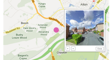
‘I can see my house from here’: Google StreetView in Qlikview (with no Extensions)
This is a relatively quick post to add to my last GoogleMaps enhancement post that put simply allows you to use what you’ve already built to drive the maps integration to add StreetView into the mix as well. Firstly thanks has to go to Alexander Karlsson – seemingly Qliktech’s ‘Head of Geeky Experimentation’ (that’s a … Continue reading

Enhance Your Qlikview Maps with a Few Simple Tweaks (& fix them if they’ve broken).
Firstly apologise for the amount of time its taken to update the blog, I can’t believe it’s been nearly 3mths since my last post. The reasons are many but chief amongst them is the fact I’ve been thinking a bit deeper about Qlikview and BI in general and have been creating some innovations in those … Continue reading
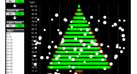
A Merry Qlik-Mas To One & All (NEW!! Qlikview Xmas Tree Object)
Just a quick post to wish everyone in the Qlikview world a very happy Xmas and to send you all my Qlikview based Xmas card (created a few years ago). This being Qlikview we’ve got a little dynamism here so click away and see what happens! So a Merry Xmas and a Happy New Year … Continue reading

From The QVDesign Crystal Ball: What’s .next for Qlikview?
In 2001 as a student I wrote a White Paper for Nokia as part of a ‘future thinking for mobile’ competition where I outlined the inclusion of GPS functionality in mobile devices, them accessing & caching map information based on GPS data, location based advertising and other related services and judging by my iPhone I … Continue reading
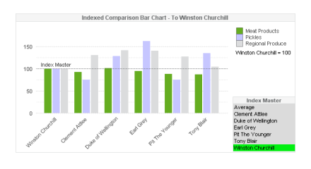
The Indexed Comparative Bar Chart – More Indexing Goodness in Qlikview
Regular followers of QVDesign will know that I’ve got a soft spot for a bit of good old fashioned indexing (it must be the economist in me) and have created a post or two to try and get it used more by Qlikview developers as, well; it’s simple and awesome. To further that end I’ve … Continue reading

Informative, Curvy & Never Before Seen (by me at least) – The Associated Curve Chart
I’ll start off by saying that I really like this chart, it started out largely as just an experiment to connect datapoints but during the development it morphed into an entirely new chart type (I’ve never seen it in Qlikview or anywhere else – please let me know if you have) that I believe can … Continue reading

Lessons for Dashboard Developers from the GB Olympic Team – Really?
The worlds of Sport and Dashboarding; there aren’t many parallels there surely? Yes, you could create a dashboard to report on sporting data and that would be very nice indeed but what about actual parallels and lessons we as dashboard developers could learn from sport? Well, as a resident of Great Britain I’ve been saturated … Continue reading

The Breakdown Bar Chart – a little bit more (in certain circumstances) than you’re average Bar Chart
The Bar Chart; the ‘Mr Consistent’ of the chart world, you might add a line or two over the top or a few symbol sets here and there, perhaps a little stacking but on the whole; the bars like those of a prison cell never change. That’s not to do the plain ol’ Bar Chart … Continue reading
